7 Metrics Dashboard Examples for GTM Teams
Explore 7 metrics dashboard examples for sales and GTM teams, with KPI layouts, drilldowns, attribution patterns, and actionable reporting ideas.
A dashboard isn't successful because it contains many charts. It earns its place when an executive can see pipeline outcomes at the top, trace them to operational drivers underneath, and drill into the channels, signals, lists, and messages that created them. That's the standard used here for these metrics dashboard examples.
The seven options below suit different GTM realities. The Social Search's Reporting and Pipeline Dashboard is built for connected outbound attribution, while Databox, Power BI, and Tableau serve teams that need template-led reporting or deeper analytical control. Geckoboard, Grafana, and Looker Studio are stronger in always-on operations, technical monitoring, or fast connector-led reporting. Teams comparing adoption should also review these dashboard reporting benchmarks, because rollout doesn't guarantee daily use. If cold-email sequencing and deliverability belong in the reporting model, Instantly is a relevant sending layer to connect. For a broader outbound system, The Social Search links activity to accountable pipeline rather than leaving teams with isolated channel reports.
Table of Contents
1. Reporting and pipeline dashboard
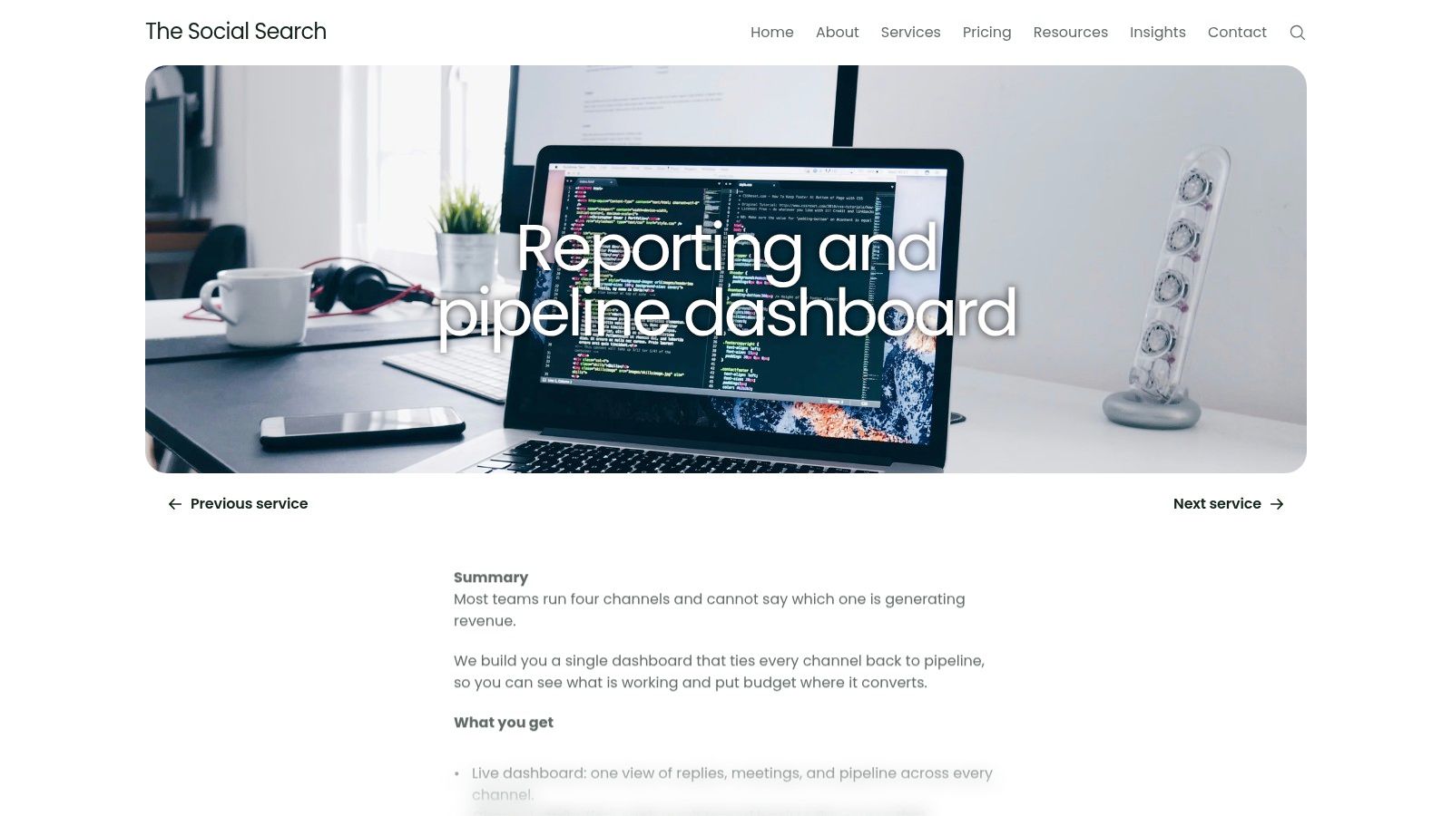
The strongest example for outbound-led GTM is a dashboard that starts with replies, meetings, and pipeline, then lets the user trace each result back to its source. The Reporting and Pipeline Dashboard from The Social Search is designed around that connection. It brings channel attribution, spend guidance, scheduled reporting, and operational performance into one live view.
That structure answers the executive question, “Which activity is creating pipeline?” It also answers the harder operating questions: which account list is producing meetings, which message is earning replies, which signal is worth routing, and which channel deserves more attention. This makes it materially different from a dashboard that reports email volume or LinkedIn activity without connecting those numbers to commercial outcomes.
What it makes visible
A useful view places pipeline KPIs above activity metrics. Beneath that executive layer, drilldowns should expose:
Channel attribution: Compare email, LinkedIn, and other outbound routes without treating every touch as equally valuable.
List performance: Identify which prioritised accounts and buyer segments are producing qualified movement.
Message performance: Connect replies and meetings to offers, angles, and specific messages.
Signal performance: See whether trigger-based prospecting improves timing and routing.
Spend guidance: Use scheduled reporting to decide where budget and operator attention should move next.
The service is built for handover, with documented systems and optional fractional GTM support. That matters for B2B teams expanding into APAC or global markets, where regional differences can make an aggregate channel view misleading. A global executive view can remain standardised while country, market, and buyer-level drilldowns preserve the context needed for action.
Practical rule: A pipeline dashboard should explain not only what changed, but which list, signal, message, and channel gave the team the opportunity to change it.
The trade-off is data dependency. Accurate attribution requires clean CRM records, sending-platform integrations, and consistent tracking. Teams without outbound activity or basic CRM discipline may need to establish those foundations first. Teams that already run outbound can use the sales pipeline reports as a useful reference point for structuring the reporting layer. An Insurance Ops Dashboard provides another example of why operational reporting must connect front-line activity to management decisions.
2. Geckoboard
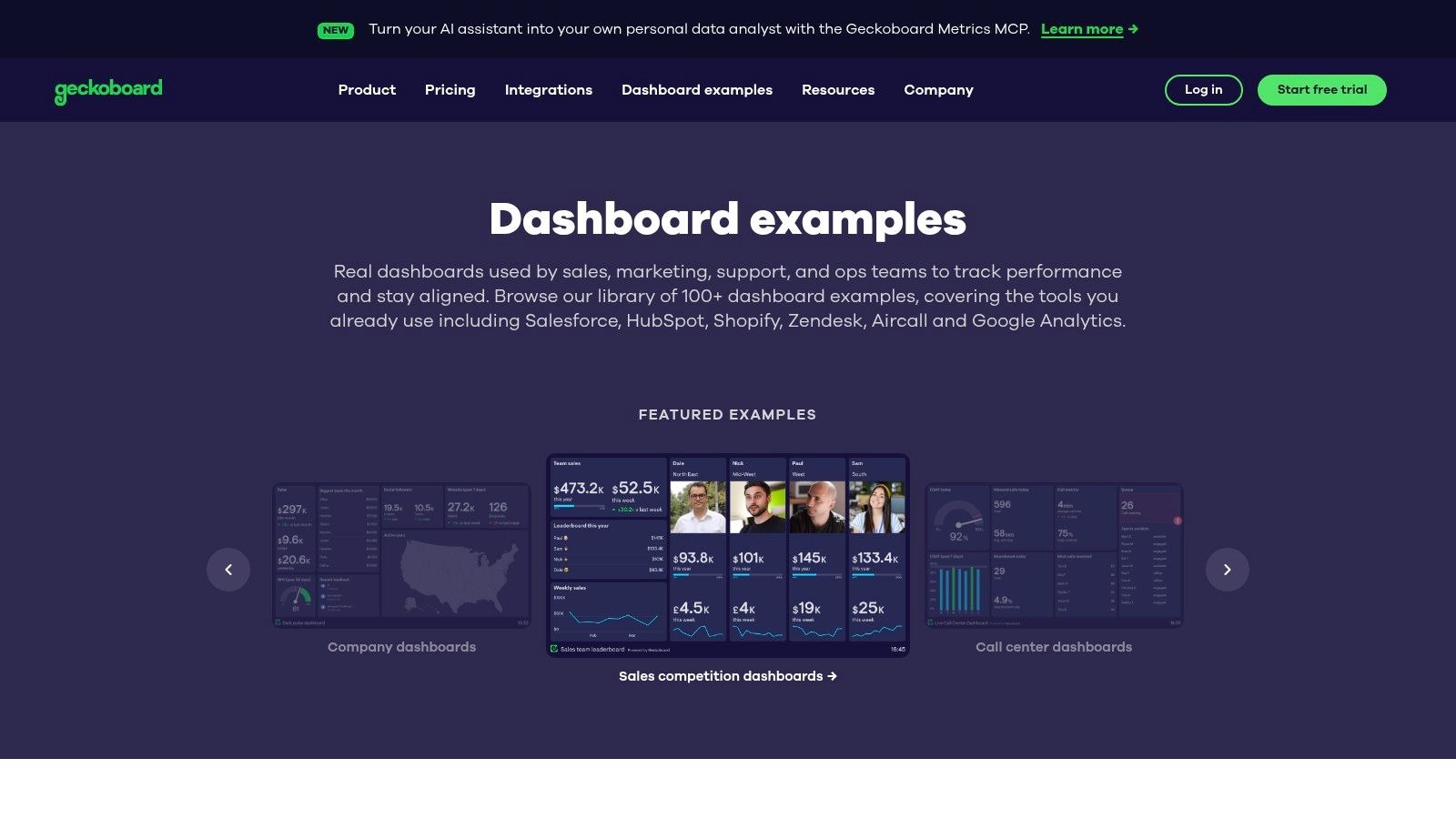
Geckoboard's value is operational focus, not template volume. Its dashboard examples show 100+ live KPI dashboard examples across support, product, sales, operations, marketing, and ecommerce, according to the provider's gallery. The designs emphasise leaderboards, service-level indicators, funnels, and trend lines, helping teams see which queue, owner, or stage needs attention now.
That focus suits an SDR team tracking current activity, a customer-success group monitoring unresolved work, or an operations team using a shared screen. Geckoboard can also display data from spreadsheets or SQL, giving teams a practical reporting layer before they adopt a more complex BI system.
The strongest designs make a narrow decision visible:
Leaderboards expose ownership and performance differences across representatives or teams.
SLA views identify queues and service risks that require intervention.
Funnel layouts show movement between operational stages without requiring a full analytical model.
Trend lines add daily context to KPI cards, making a sudden change easier to investigate.
Shared links that do not require viewer accounts can distribute a common view quickly. That convenience has a clear boundary. Executives who need multi-touch attribution, historical modelling, or account-level investigation will need data structures beyond the dashboard's presentation layer. The examples offer useful design patterns, but some depend closely on Geckoboard's own visual model.
Strategic principle: Keep an always-on dashboard narrow enough to trigger action, then connect it to drilldowns that explain the cause.
For GTM leaders, Geckoboard works best as the operational surface beneath executive reporting. It can display current activity and exceptions, while attribution across signals, lists, messages, and channels must already be modelled in the underlying data. Without those relationships, the dashboard reports movement but cannot identify which operating choice created pipeline.
3. Databox
Databox is useful when reporting needs to become operational before the underlying model is fully custom. Its dashboard examples use a template-first approach across revenue, marketing, product, and customer success. Connectors for sources such as HubSpot, Google Ads, GA4, Facebook Ads, and Shopify help teams assemble cross-channel views without designing every visual from scratch.
The practical value is speed with a defined limit. A marketing leader can place acquisition and conversion signals beside revenue outcomes, while a customer team can align service activity with retention measures. That arrangement exposes whether headline KPIs have an operational counterpart. It does not, by itself, prove that a particular list, message, or channel created pipeline.
Strategic principle: Treat a template as a reporting hypothesis. Keep it only when its KPIs connect to an owner, a workflow, and a drilldown.
A Databox setup works well as an initial executive layer. Users can compare channel performance, inspect changes over time, and establish a shared baseline for recurring reports. Agencies and GTM teams also gain a repeatable starting point when each client or business unit uses familiar data sources.
The main risk is inherited structure. A ready-made marketing view may show traffic, leads, and conversion clearly while omitting meetings, opportunity stages, message-level activity, or account context. Analysts should test whether each executive metric can be traced to the operational records behind it. If attribution depends on bespoke joins or complex transformations, warehouse or BI tooling may be required.
Documented sales pipeline automation can provide the operational destination for activity shown in the dashboard, but the relationship still needs explicit modelling. Databox is therefore a sensible choice for fast, connected reporting across known sources. It is less suitable when the governing question is which signal and message caused a pipeline change.
4. Tableau
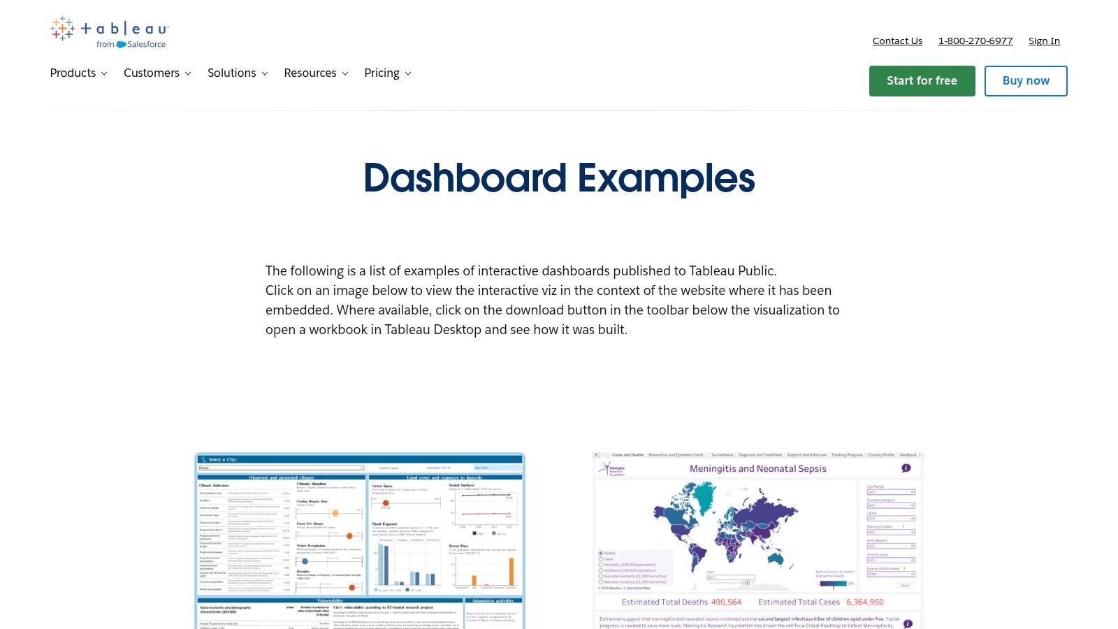
Tableau's value lies in connecting an executive metric to the evidence beneath it. Its dashboard examples and public workbooks show filters, parameters, navigation, container layouts, and multi-page stories. Where downloads are enabled, analysts can inspect calculations and structure instead of copying surface-level styling.
A useful Tableau view starts with a KPI such as pipeline conversion, then supports filtering by region, segment, channel, or period. That sequence helps global GTM teams distinguish a broad performance change from a country-specific issue. It can also connect campaign signals, messages, lists, and channel activity to the opportunity records that determine whether attribution is credible.
A practical review asks four questions:
Which executive KPI moved?
Which market, segment, or cohort accounts for the change?
Which operational driver, channel, message, or list is associated with it?
Can the user reach a record, cohort, or underlying calculation?
The dashboard design best practices are useful here because visual clarity matters only when filters change a decision. A polished view still creates ambiguity if metric definitions are unclear, owners are missing, or drilldowns stop before the operational record.
Strategic principle: A dashboard earns executive trust when every headline KPI has a definition, an owner, and a traceable path to operational evidence.
Tableau introduces implementation overhead. Reusing a public design requires Tableau skills, suitable data modelling, and licensing, while some examples favour storytelling over daily workflow clarity. Its flexibility suits mature analytics teams. A small outbound team seeking quick message-to-meeting attribution may need less machinery.
5. Microsoft Power BI
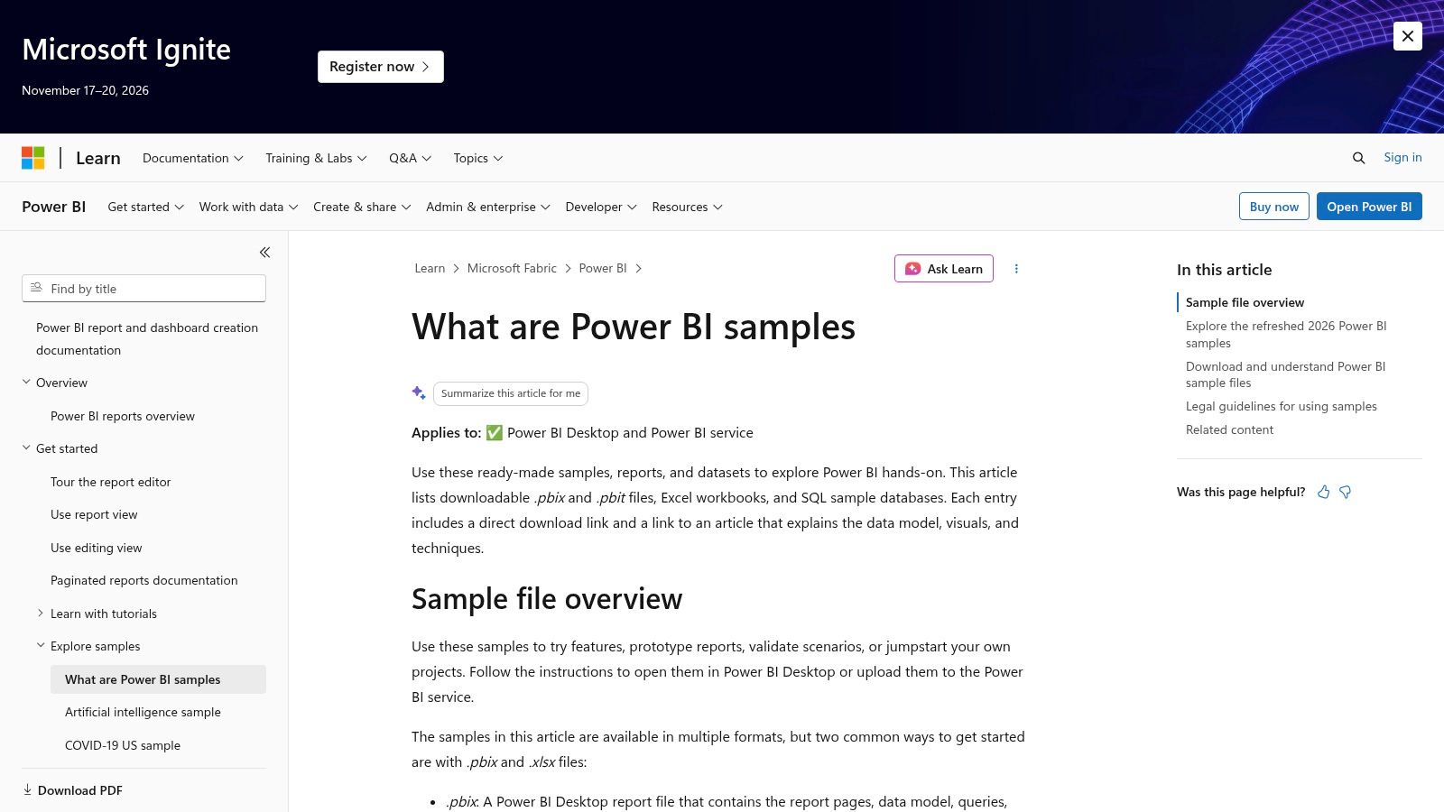
Microsoft Power BI's sample datasets and reports offer working examples of dashboard systems rather than isolated screenshots. Their data, models, and visuals can be opened in Power BI Desktop or the service, allowing users to inspect slicers, drilldowns, drill-through pages, mobile layouts, and DAX-driven KPIs.
Power BI is most useful when an executive view must connect to a deeper analytical model. A revenue leader can start with pipeline and conversion indicators, then examine representatives, stages, regions, or accounts. Marketing and sales teams can apply the same structure to attribution when campaign signals, messages, lists, channels, and opportunity records share consistent relationships.
Why the model matters
Power BI makes the difference between a dashboard and a reporting system visible. Charts form only the presentation layer. The underlying model determines whether “pipeline created,” “conversion,” and “marketing ROI” retain the same meaning across teams, filters, and reporting periods.
A useful executive model joins financial systems, CRM records, marketing platforms, and workforce information. It should define CAC, CLV, conversion rate, and marketing ROI in relation to business decisions, then preserve drilldowns to the operational records behind each KPI. The platform supports that modeling discipline, although implementation quality depends on the team building it.
A KPI isn't standardised until its formula, owner, business meaning, and allowed filters are written down.
The trade-offs are practical. Power BI's default visual style can appear generic without customisation, and external sharing may require Pro or Premium licensing. Building reliable relationships and DAX measures also requires more modeling skill than a connector-led template tool.
Teams should assess what revenue operations requires from shared data before selecting the platform. Without agreed ownership and definitions, a more powerful BI tool can make disagreements more detailed without making decisions better.
6. Grafana
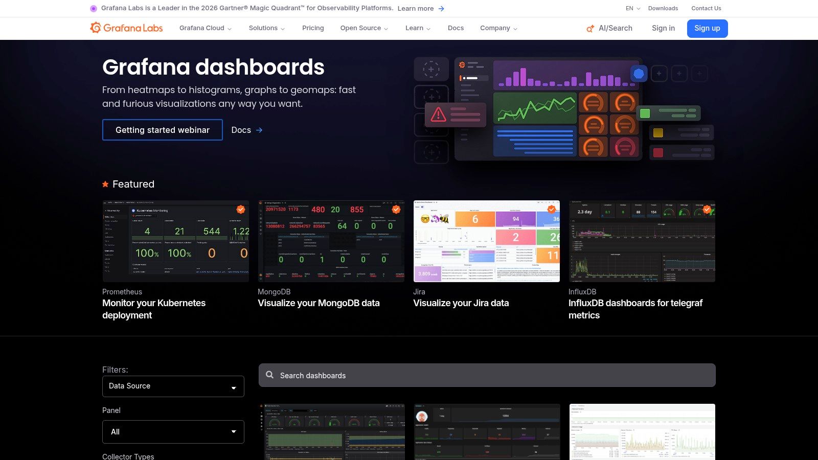
Grafana's dashboard library is built for teams that need live technical and operational monitoring. Its community includes ready-to-import JSON dashboards for infrastructure, product analytics, services, metrics, logs, and traces. The public Grafana Play environment and documentation show how panels, annotations, alerts, and dashboard-as-code practices fit together.
Grafana is a strong choice when the decision is time-sensitive and technical: is a service healthy, has an error pattern changed, or has an operational threshold been crossed? Engineering teams can provision dashboards through version-controlled JSON, which makes changes more reproducible than manually editing every panel.
The GTM boundary
Grafana can support commercial metrics, but many community examples are observability-focused rather than GTM-focused. A sales leader looking for list-level attribution or message-level pipeline analysis may find fewer immediately relevant patterns than an engineering manager monitoring service performance.
Its strengths are clear:
Real-time monitoring: Surface technical and operational changes as they occur.
Alerting patterns: Route attention toward exceptions rather than requiring constant manual review.
Infrastructure flexibility: Connect panels to varied data sources and provision them as code.
Open ecosystem: Adapt community examples when their data model and documentation are sound.
The trade-off is uneven community quality. A dashboard may look useful while lacking clear ownership, business definitions, or reliable documentation. Grafana works best when a technical team owns the data model and alert logic. It shouldn't be selected merely because a public example looks polished.
For GTM organisations, Grafana can sit beside a pipeline dashboard, monitoring the systems that support sending, routing, enrichment, and CRM synchronisation. It is less likely to be the best primary executive view unless the company has a clear reason to put technical service health directly beside commercial outcomes.
7. Looker Studio
Looker Studio's report gallery is a practical source for acquisition and conversion reporting. Its templates connect naturally with GA4, Google Ads, Search Console, YouTube, and other Google services, and many can be copied and adapted. That makes it attractive to teams that need a working marketing view without building a complete BI environment.
The typical use case is a web-to-lead or acquisition funnel. A team can compare traffic sources, campaign activity, search performance, and conversion behavior in one report. The tool is also useful for agencies that need repeatable reporting across clients, provided the underlying definitions remain consistent.
Where it stops answering the executive question
Looker Studio is strongest close to the marketing-source layer. It can show which campaigns and landing pages generate activity, but a complete GTM answer may require CRM data, opportunity stages, outbound messages, and offline outcomes. Blended data can become difficult when teams need advanced calculated fields or warehouse support.
A useful reporting design separates three freshness thresholds: source freshness, target freshness, and an alert window. One documented pattern expects source events within the last 2 hours, derived data to lag the source by no more than 30 minutes, and escalation after the lag exceeds the threshold for 15 minutes. These thresholds are described in data freshness SLA guidance, and they illustrate why “updated recently” isn't a sufficient operational definition.
Looker Studio also needs a visible data-as-of timestamp based on the latest underlying record, not merely the page-render time. Dashboard freshness guidance explains why that distinction helps viewers judge whether a number is current. For teams reporting on email performance, email marketing metrics can help structure the acquisition layer before it is connected to pipeline outcomes.
7 Metrics Dashboard Tools Compared
Item | Implementation Complexity 🔄 | Resource Requirements ⚡ | Expected Outcomes 📊 | Ideal Use Cases 💡 | Key Advantages ⭐ |
|---|---|---|---|---|---|
Reporting and pipeline dashboard | 🔄 Moderate–High, integrations and CRM coordination; typical build ~3 weeks | ⚡ Moderate, requires clean CRM, sending platforms, tracking; optional fractional GTM lead | 📊 Actionable pipeline attribution, spend guidance, scheduled reporting | 💡 Outbound-led B2B teams (APAC/global) needing pipeline-to-message attribution | ⭐ Single source of truth; ties meetings/pipeline to lists/messages; handover-ready |
Geckoboard | 🔄 Low, plug‑and‑play layouts for team displays | ⚡ Low, works with Sheets/SQL and simple connectors | 📊 Day‑to‑day operational visibility (leaderboards, SLAs, trends) | 💡 Operational teams, SDR/CS, team TV dashboards and shared links | ⭐ Practical, TV‑ready layouts; easy sharing without viewer accounts |
Databox | 🔄 Low–Medium, template install flows and connectors | ⚡ Moderate, connectors to HubSpot, Ads, Shopify, etc. | 📊 Rapid cross‑channel GTM dashboards with auto‑populating KPIs | 💡 GTM teams that want fast, template-driven cross‑channel reporting | ⭐ Large template library (300+); fast to stand up dashboards |
Tableau | 🔄 Medium–High, requires Tableau skills and design work | ⚡ High, Tableau licensing and analyst expertise | 📊 Rich interactive analytics, drill‑downs and storytelling patterns | 💡 Analysts building executive/multi‑page interactive dashboards | ⭐ Deep interactivity and many downloadable public examples to inspect |
Microsoft Power BI | 🔄 Medium, DAX and report design; local file experimentation | ⚡ Moderate–High, Power BI Desktop + Pro/Premium for sharing | 📊 Hands‑on sample reports (data, model, visuals) for testing and adaptation | 💡 Teams wanting to experiment with real report files and drill‑throughs | ⭐ End‑to‑end sample files; easy local testing of interactions |
Grafana | 🔄 Medium, importable JSON dashboards; dashboards-as-code workflows | ⚡ Moderate, requires metrics/log sources and engineering ops skills | 📊 Real‑time observability/KPI and SLO dashboards with alerting patterns | 💡 Engineering, SRE and ops teams building real‑time dashboards | ⭐ Open‑source flexibility; fast bootstrap and versionable JSON dashboards |
Looker Studio (Google) | 🔄 Low, copyable templates and connector setups | ⚡ Low–Moderate, native GA4/Ads connectors; BigQuery for complex blends | 📊 Fast web and marketing acquisition→conversion reporting | 💡 Marketers using GA4/Google Ads/Search Console needing quick reports | ⭐ Very fast for Google ecosystem; many free, copyable templates |
Turn Dashboard Inspiration Into a Reporting System
The right tool depends on the decision the dashboard must support. Choose Geckoboard for always-on operational visibility, especially where shared screens, leaderboards, SLAs, and simple trends matter. Choose Databox or Looker Studio when connector-led reporting can solve the immediate problem quickly. Choose Tableau or Power BI when executives need analytical depth, drill-throughs, governed definitions, and segmented views across markets or functions. Choose Grafana when real-time technical monitoring and alerting are central.
Choose The Social Search's Reporting and Pipeline Dashboard when outbound attribution is the commercial problem. Its role is not to replace every analytics tool. It is to connect replies, meetings, pipeline, channels, signals, lists, and messages so B2B teams can decide what to scale and what to stop. That distinction matters for APAC and global GTM motions, where a single aggregate channel number can hide different buyer behavior by country or segment.
Build the system in a deliberate sequence:
Define stakeholder decisions: Write down what executives, revenue leaders, and operators must decide from the dashboard.
Place pipeline KPIs first: Put meetings, opportunities, pipeline, and conversion outcomes above activity counts.
Add operational drilldowns: Trace changes to channels, markets, signals, lists, messages, and owners.
Standardise attribution: Use consistent rules for how a signal, message, or channel receives credit.
Set freshness controls: Display the data-as-of timestamp and define when stale data should trigger escalation.
Create a review cadence: Use scheduled reporting to turn dashboard access into a recurring operating habit.
IBM's summary of Gartner data reports that analytics and business-intelligence use increased in 87% of surveyed organisations, while ABI tools were used by only 29% of employees on average, a gap that changed little over a 7-year period. The lesson for dashboard owners is direct. Adoption problems aren't solved by adding more charts, and a dashboard that isn't used can't improve decision quality.
A QMO dashboard case study offers a different lesson. A mid-sized software development company reported a 20% reduction in defect density, a 30% increase in deployment frequency, a 25% reduction in mean time to recovery, and a 15% increase in customer satisfaction after connecting quality metrics with CI/CD, incident management, and test coverage tracking in one operational control loop. The figures appear in this QMO dashboard case study, but the more important point is structural: the dashboard supported action, rather than merely presenting results.
Cisco's case study similarly reports report-generation time falling from 40 hours to 15 minutes, data accuracy improving from 85% to 99.9%, and complex cross-database query response averaging 0.3 seconds, alongside other reported availability, adoption, decision-speed, and savings outcomes. Those figures are documented in the Cisco dashboard case study. The broader conclusion is that dashboard value comes from validated data, reliable architecture, and executive use together.
For a broader executive reporting perspective, the transformation success report pack is a useful companion. The strongest dashboard isn't the most elaborate one. It's the one that makes the next GTM action obvious, assigns ownership, and lets the team explain why pipeline moved.
The Social Search designs, builds, and runs outbound systems that connect ICP definition, data, messaging, sending, routing, and reporting for B2B teams selling into APAC and global markets. If your current metrics dashboard can't trace meetings and pipeline back to the signals, lists, messages, and channels that produced them, visit The Social Search to explore a reporting and pipeline system built for ownership, handover, and ongoing GTM optimisation.
