Dashboard Design Best Practices for GTM Success in 2026
Discover dashboard design best practices for GTM dashboards. Covers KPI selection, segmentation, visualization, alerting, & documentation.
Your sales leader opens the dashboard before the pipeline review and sees dozens of tiles, channel totals, activity counts, reply rates, and filters. The SDR manager sees a different problem, a sequence that appears active but produces fewer replies. Operations sees inconsistent account stages and stale records. Everyone is looking at the same screen, yet nobody has a shared answer to the question, "What should we do next?"
That's the failure mode behind many GTM dashboards. They collect data successfully but don't connect it to decisions, ownership, or workflow. Effective dashboard design best practices start with a narrower purpose. The dashboard should help a specific person make a specific decision, with enough context to act and enough detail to investigate.
For GTM teams, that also means connecting the dashboard to the systems that generate the activity being measured. If you're tracking cold email performance, tools like Instantly are relevant for sequencing and deliverability workflows. If your team runs LinkedIn outreach, HeyReach fits naturally into the reporting picture. If your dashboard depends on contact and account enrichment, Apollo is a relevant source layer to consider. And if your team is building dashboard-driven SEO reporting and content operations, SearchAtlas and Outrank are also contextually useful platforms to connect with measurement.
Table of Contents
Introduction to Actionable Dashboards
An actionable dashboard isn't a decorated report. It's an operating surface for a team.
For an outbound SaaS team, that might mean showing whether the right accounts entered a sequence, whether messages generated meaningful replies, whether those replies became meetings, and where qualified pipeline came from. A sales leader needs the overall movement. An SDR needs the next account or task. Revenue operations needs to know whether the underlying data and attribution can be trusted.
A 2024 evaluation of public health dashboards found that familiar charts, simple layouts, and clear context focused attention and supported quick decisions (public health dashboard evaluation). The lesson transfers well to GTM reporting. Familiar bar charts, clear labels, visible definitions, and a restrained layout usually outperform clever visualizations that require explanation.
Teams consolidating multiple sources can use a consolidate marketing data with a dashboard approach to bring campaign, CRM, and channel information into one view. For a more focused implementation, a reporting and pipeline dashboard should connect activity to pipeline rather than merely display channel volume.
Practical rule: If a user can't identify the decision supported by a dashboard within a few seconds, the screen probably contains more information than the workflow needs.
Selecting KPIs and Segmenting Data
The most important dashboard decision happens before anyone chooses a chart. Decide which business question the screen must answer, then select only the metrics that help answer it.
Start with the ideal customer profile. Define the account characteristics that make an opportunity relevant, such as market, company type, buying context, or operational need. Then map the path from target account to contacted prospect, engaged prospect, meeting, opportunity, and closed outcome. The exact stages will vary, but every stage should have an owner and a clear entry condition.
In practice, the KPI model should reflect the tools and channels that feed the workflow. For example, reply quality and bounce trends matter when measuring cold email systems such as Instantly. Connection rates, acceptance rates, and booked meetings are more relevant when a team runs LinkedIn automation through HeyReach. If enrichment quality affects routing or segmentation, Apollo can influence whether the dashboard reflects usable targeting data or noisy records.
Separate leading indicators from lagging indicators. Leading indicators help the team detect whether current activity is moving in the right direction. In outbound, that could include valid contacts entering a sequence, positive replies, or meetings accepted by sales. Lagging indicators confirm outcomes, such as qualified opportunities or sourced pipeline. A dashboard that shows only lagging outcomes arrives too late for operators to correct execution.

Build the metric foundation
Use a simple validation sequence:
Define the decision: Write the action the user should take when the metric changes.
Name the owner: Assign responsibility for reviewing and responding to the signal.
Verify the source: Check where the value originates, how it is transformed, and whether duplicates or missing fields distort it.
Set the segment: Break the result down only when the breakdown can change a decision.
Test the definition: Ask sales, SDR, and operations stakeholders whether the metric means the same thing to each of them.
Useful segments often include region, account tier, persona, source list, sequence type, and owner. Avoid adding every available dimension. If a segment doesn't alter prioritization, messaging, routing, or resourcing, it's probably a filter for curiosity rather than an operating requirement.
Recent reviews emphasize that effective dashboards should start with user involvement, actionable metrics, data quality, and workflow integration, while many guides skip these steps (dashboard review on usability and workflow integration). That omission creates expensive confusion. A polished reply-rate tile won't help if the CRM counts automated responses as positive replies or if the source list isn't tied to the sequence that generated the activity.
A guide for leaders on OKR measurement can help connect operational metrics to broader objectives. For lifecycle definitions and stage-level KPI logic, document the relationship between the dashboard and the customer life cycle stages and KPIs your team uses.
Visualization Patterns for Clarity
A GTM dashboard should read from the top down. Put the metric that determines the immediate conversation at the top, place trends and comparisons beneath it, and reserve detailed records for drill-down.
That hierarchy mirrors the logic of a control panel. Dashboard history is often traced through vehicle instrument displays, including the 1847 origin of the term "dashboard," the Oldsmobile Model R in 1901, and the electronic instrument cluster introduced with the Aston Martin Lagonda in 1976 (history of car dashboard design). Those displays prioritized legibility, status, and fast action. GTM dashboards should do the same.

Match the visual to the question
Use a KPI card when the user needs an immediate status. Use a sparkline when the direction over time matters but the exact values don't require close inspection. Use a bar chart to compare segments, such as meetings by region or replies by sequence. Use a line chart to show movement across time. A table belongs at the bottom when users need to identify individual accounts, records, or owners.
Heatmaps can expose concentration, such as activity by weekday and hour, but they're easy to misread without labels and a clear scale. A practical heat maps Google Analytics guide is useful when teams need to interpret behavior visually, though the same caution applies to outbound: color intensity should support a question, not replace one.
Keep color consistent. Reserve high-salience colors for exceptions, use labels that explain status plainly, and don't rely on color alone. A positive reply should remain identifiable through text, iconography, or position for users with different visual needs.
Experts recommend 5-9 visualizations and a first screen that answers the core question in roughly 5 seconds, using a question-first hierarchy (dashboard design guidance). Treat that as a practical constraint, not a design law. If the workflow requires more detail, use drill-downs rather than shrinking every chart until nothing is readable.
An outbound sales pipeline report works best when the first view explains movement and the lower layers explain causes. The user shouldn't have to scan every chart to discover which segment needs attention.
Alerting and Real-time Monitoring
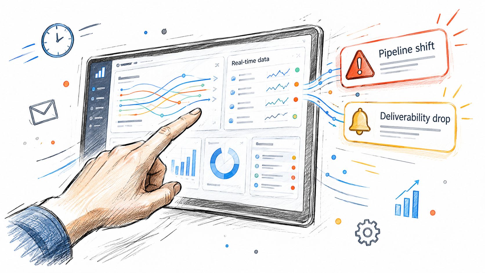
A dashboard that nobody checks during the workday is a passive archive. Alerts turn it into an operating system, but only when each alert has a clear owner and response.
Start with events that require intervention. A sudden increase in bounces may justify a deliverability review. A sustained decline in positive replies may require message, list, or targeting analysis. A meeting-routing failure may need immediate operations attention. Don't alert on every fluctuation. Alert when a condition crosses a meaningful boundary or persists long enough to indicate a real issue.
Use the least disruptive channel that matches the urgency. Email works for review queues and scheduled summaries. Slack suits team-level operating signals. SMS should be reserved for issues where delay creates material risk. Each notification should include the affected segment, time period, current status, likely owner, and next step.
Teams that monitor outreach performance across channels may also want alerts tied to the execution layer itself. For example, cold email teams using Instantly may care about bounce spikes and sending interruptions, while LinkedIn teams using HeyReach may need visibility into account activity and campaign slowdowns.
Design alerts people can trust
False positives train teams to ignore alerts. Add suppression rules for planned pauses, maintenance, small samples, and known data delays. Show the last-updated timestamp next to important metrics so users can distinguish a fresh signal from a stale one.
A 2025 to 2026 trend summary identifies visible freshness cues, accessibility, and mobile responsiveness as core dashboard adoption requirements (dashboard visualization trends). That matters for outbound teams because managers often review pipeline away from a desk, while operators need quick access during active campaign changes.
Document what happens after every alert. For example, a bounce warning might route to the deliverability owner, pause affected activity, validate the source records, and reopen the workflow only after review. The alert isn't the outcome. The corrected process is.
For broader operating-model context, teams can use a documented revenue operations framework to define how sales, marketing, and operations share responsibility for signals and follow-up.
Executive and Operational Dashboard Views
Executives and operators shouldn't receive identical dashboards with different filters. They use the same underlying data to make different decisions, so the interface should reflect the decision depth, urgency, and context each role requires.
A useful design keeps the data model synchronized while separating presentation. Executives need a concise view of pipeline movement, source contribution, forecast context, and material exceptions. Operators need account-level records, sequence performance, ownership, data freshness, and workflow status. Combining both audiences into one screen usually creates a compromise that satisfies neither.
Successful dashboard design relies on information hierarchy, visual flow, and cognitive load management (dashboard layout principles).
Aspect | Executive View | Operational View |
|---|---|---|
Primary question | Is GTM performance moving toward the business objective? | What needs attention or correction today? |
Metrics | Top-line pipeline, conversion movement, source contribution, exceptions | Contact coverage, sequence activity, replies, meetings, routing, record status |
Layout | Summary cards, annotated trends, limited comparisons | Filters, drill-down tables, segment views, task-oriented status panels |
Update cadence | Scheduled review cadence with freshness shown clearly | Frequent updates aligned with active campaign and routing workflows |
Interaction depth | Light filtering and selective drill-down | Account, owner, sequence, region, and source-level investigation |
Annotation | Explain causes, assumptions, and material changes | Explain definitions, exceptions, and required operating actions |
Keep shared definitions underneath
The executive view shouldn't rename a metric that operators use differently. Define terms such as positive reply, accepted meeting, qualified opportunity, and sourced pipeline in one metric dictionary, then present them at different levels of detail.
The operational view should expose enough provenance to investigate. An SDR manager may need to see which sequence, list, or owner contributed to a change. An executive may only need the summarized source contribution and an annotation explaining the movement.
Mobile access also changes the design threshold. If leaders review a dashboard on a small screen, prioritize readable cards, short labels, and a clear exception path. Operators working from a desktop can use denser drill-downs, but density still needs structure.
Documentation and Handover Best Practices
A dashboard without documentation becomes tribal knowledge. The original builder knows which filter excludes test records, which field controls attribution, and why a metric differs from the CRM view. Everyone else sees a number and guesses.
Create a living playbook before handover, not after the first incident. Each dashboard should have a clear purpose, named personas, and a description of the decisions it supports.
Document the operating layer
Include these fields for every important metric:
Definition: State exactly what the metric includes and excludes.
Source: Name the system, table, field, or integration that supplies the data.
Transformation: Explain joins, deduplication, attribution, and calculated logic in plain language.
Refresh behavior: Record the expected refresh pattern and display the last successful update.
Filters: Explain default filters, optional filters, and any exclusions.
Owner: Assign responsibility for data quality, dashboard maintenance, and business interpretation.
Action: Describe what the team should do when the value rises, falls, or becomes unavailable.
Add annotated screenshots that show where users should start and how they reach account-level detail. Include example queries or investigation paths where the platform supports them, but keep the explanation usable for non-technical stakeholders.
Make the handover executable
Run a workshop with the people who'll operate the dashboard. Ask each person to complete realistic tasks, such as identifying the source of a meeting, finding a stalled segment, or explaining why two views differ. Correct the playbook when users hesitate. Their confusion is a documentation defect, not a training failure.
Create an ownership roadmap with a current owner, backup owner, review cadence, change-request process, and escalation path for broken data. A go-to-market consulting engagement can support this kind of system design when reporting needs to connect with ICP, outbound execution, routing, and pipeline review.
Handover test: A new operator should be able to interpret a metric, trace its source, identify the responsible owner, and take the documented next step without relying on the original builder.
Don't hide limitations. If a source refreshes slowly, attribution is incomplete, or a stage depends on manual entry, write it beside the metric. Trust grows when users can see both what the dashboard knows and where its certainty ends.
Conclusion and Next Steps
Dashboard design best practices matter because GTM teams don't need more information. They need a reliable path from signal to decision to owner.
Choose KPIs around the audience and workflow. Put the primary question at the top, use supporting visuals to explain movement, and move detail into drill-downs. Add alerts only when someone can respond, create separate executive and operational views over a shared data model, and document every definition, source, filter, and handover responsibility.
This week, audit one dashboard. Remove metrics that don't support a decision, label the data freshness, test the first-screen question with an executive and an operator, and write the response process for one important alert. Then review the changes with the people who'll use the dashboard, not only the people who built it.
The Social Search designs and runs outbound GTM systems that connect ICP definition, data, messaging, channel execution, and reporting into an owned operating workflow. Visit The Social Search to discuss a dashboard and GTM system your team can operate, measure, and hand over with confidence.
