What Is a Call to Action? Definition, Examples, and Best Practices
Learn what a call to action is, why it matters, and how to write CTAs that boost clicks, leads, and conversions across websites, ads, and email today.
A call to action is the part of your marketing that tells someone exactly what to do next. It can be a button, a hyperlink, or a short line of copy that moves a visitor from reading to acting, whether that means signing up, downloading, booking a demo, or buying. In practical terms, CTAs sit at the point where attention turns into measurable response. (knowledge.hubspot.com)
Why CTAs matter
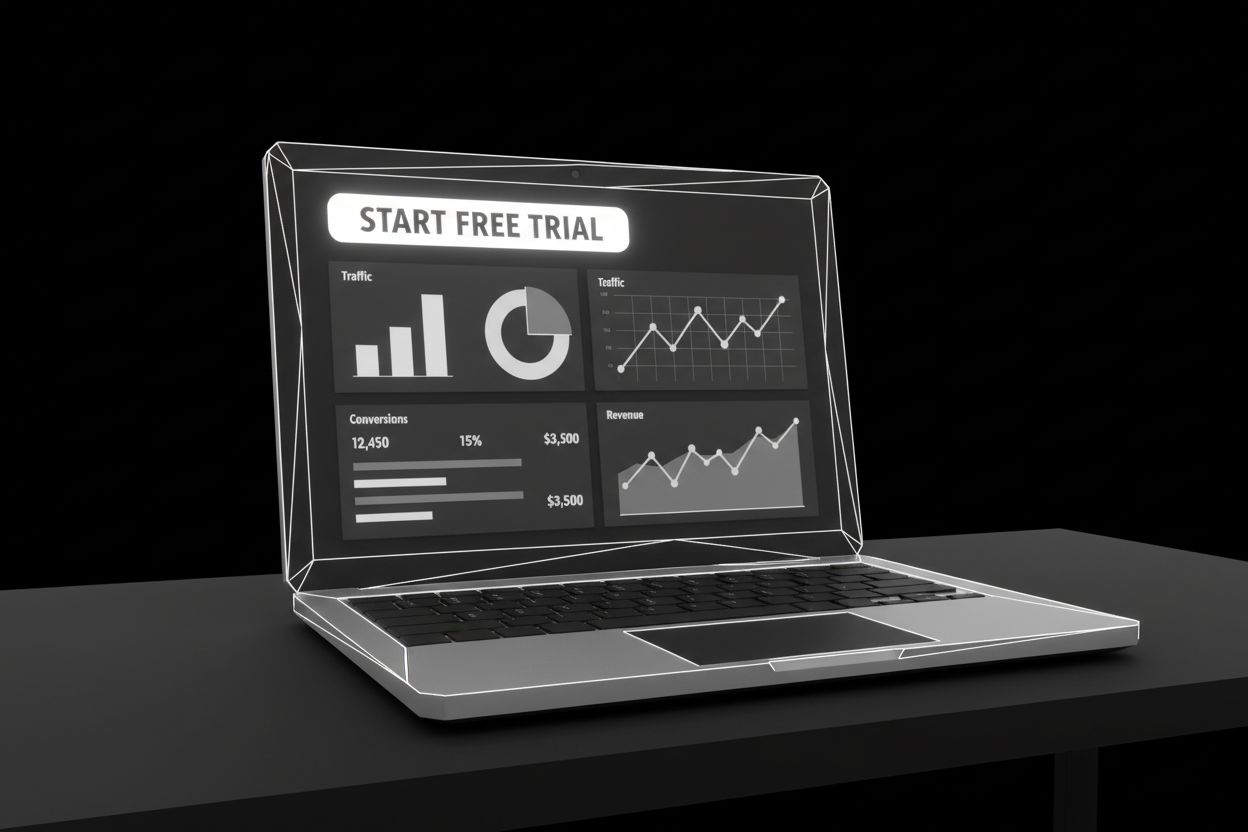
Without a CTA, even good content can leave people wondering what to do next. Optimizely describes CTAs as signposts that point users toward the next step, while HubSpot defines them as buttons or hyperlinks used to drive prospective customers to your website and track clicks. That is why a CTA is not just decoration. It is the part of the page that turns interest into a lead, a sale, a booking, or a conversation. If you are building a system around forms, follow-up, and conversion, automated lead generation works much better when every page has one clear next step. (optimizely.com)
CTAs matter in lead generation because they connect traffic to action. They also matter in paid media, email, social media, and content marketing because each channel needs a simple bridge between curiosity and conversion. Mailchimp and Campaign Monitor both stress that CTAs should tell the user what happens next and make that step obvious. In other words, good marketing does not just attract attention. It guides it. (mailchimp.com)
CTA examples by channel
The best CTA depends on where the person is in the journey. A blog reader is usually looking for a useful next step, while someone on a pricing page is much closer to a booking or purchase decision. HubSpot’s CTA examples and Mailchimp’s guidance both show that the strongest call to action matches the page intent instead of forcing the same message everywhere. (blog.hubspot.com)
Here are practical CTA examples by channel:
Website homepage:
See pricing,Book a demo, orGet started.Landing page:
Download the guide,Claim your free trial, orReserve my spot.Blog post:
Get the checklist,Read the full case study, orSee the template.Email campaign:
Join free for a month,Save my seat, orContact sales.Meta and TikTok ads:
Start free trial,Claim the offer, orGet the lead magnet, especially when your paid ads management keeps the ad promise aligned with the landing page.Social media posts and reels:
Tap to learn more,DM us GUIDE, orWatch the walkthrough, which is easier to keep consistent with automated social media.Product pages:
Add to cart,Buy now, orCheckout now.Webinars and lead magnets:
Save my seat,Access the replay, orDownload the workbook.
If the visitor is not ready for a form, an automated AI chat agents flow can continue the conversation and qualify the lead without putting all the pressure on one click. That is especially useful when your CTA is designed to start a conversation instead of closing a sale immediately. (optimizely.com)
What a CTA is, and what it is not
A CTA is the message or prompt that tells someone what to do next. The button or link is the vehicle that carries that message, and the headline is the setup that gives it context. On a strong page, those three elements work together, but they are not the same thing. Optimizely’s glossary treats a CTA as the primary button or link a page wants visitors to click, and HubSpot describes it as a button or hyperlink used to drive clicks. If your landing page is part of that promise, automated website creation can help you keep the layout, copy, and action aligned. (support.optimizely.com)
This distinction matters because many pages confuse the reader by making the text vague, the button small, or the next step unclear. A headline might attract attention, but the CTA is what converts that attention into an action the business can measure. (optimizely.com)
How to write a good CTA

Good CTA copy is clear, short, and tied to a specific payoff. Optimizely says effective CTAs use action words and are usually no more than five to seven words, while Mailchimp emphasizes benefit, clarity, and first-person language when it helps the action feel more personal. The goal is simple. A user should understand what happens next before they click. (optimizely.com)
Start with a strong verb
Use words like download, reserve, start, book, compare, or contact. Action words do the heavy lifting because they tell people exactly what kind of response you want. (optimizely.com)
Make the benefit obvious
A CTA works better when the reader can see what they get in return. Get my free guide is more compelling than Submit, and Start your free trial feels easier to understand than a generic Sign up. Mailchimp and Optimizely both highlight benefit-driven language because it removes hesitation. (optimizely.com)
Keep it short and specific
A CTA should be easy to scan in one glance. Long phrases feel heavier, especially on mobile and in email. Optimizely recommends keeping CTA copy short, and Mailchimp warns against vague, generic wording that does not tell the user what comes next. (optimizely.com)
Match the CTA to intent
A visitor who just discovered your brand usually needs a softer step, such as Read the guide or Watch the walkthrough. Someone comparing offers may be ready for See pricing or Book a demo. HubSpot’s examples make this point clearly. Strong CTAs fit the stage of the journey instead of pushing every visitor into the same action. (blog.hubspot.com)
Keep the promise on the next page
A CTA is a promise. If someone clicks Get the checklist, the landing page should deliver the checklist fast and without confusion. Campaign Monitor calls out this alignment directly, and that is why the CTA, the page copy, and the form or offer need to match. (campaignmonitor.com)
CTA psychology that increases clicks
People click when the next step feels worthwhile, specific, and low risk. Urgency can help, especially when the message includes a deadline or a limited-time offer, but it works best when it is tied to a real benefit. Mailchimp points out that time-sensitive language can create FOMO, and Campaign Monitor also notes that limited-time offers can push people to act now instead of later. (mailchimp.com)
Trust matters just as much. A CTA like Talk to us, Contact sales, or Join free for a month works because it lowers uncertainty. Mailchimp’s examples show that good CTA copy often removes risk, signals credibility, or explains the next step more clearly. That is why Cancel anytime and Free trial are so effective in many offers. They make the choice feel safer. (mailchimp.com)
Curiosity can help too, but only when it points to something concrete. See what’s next or Read more can work if the surrounding content gives enough context. On their own, though, these phrases can be too vague. The strongest CTA psychology usually blends curiosity with a real payoff, not mystery for its own sake. (mailchimp.com)
CTA design tips for websites, emails, and ads
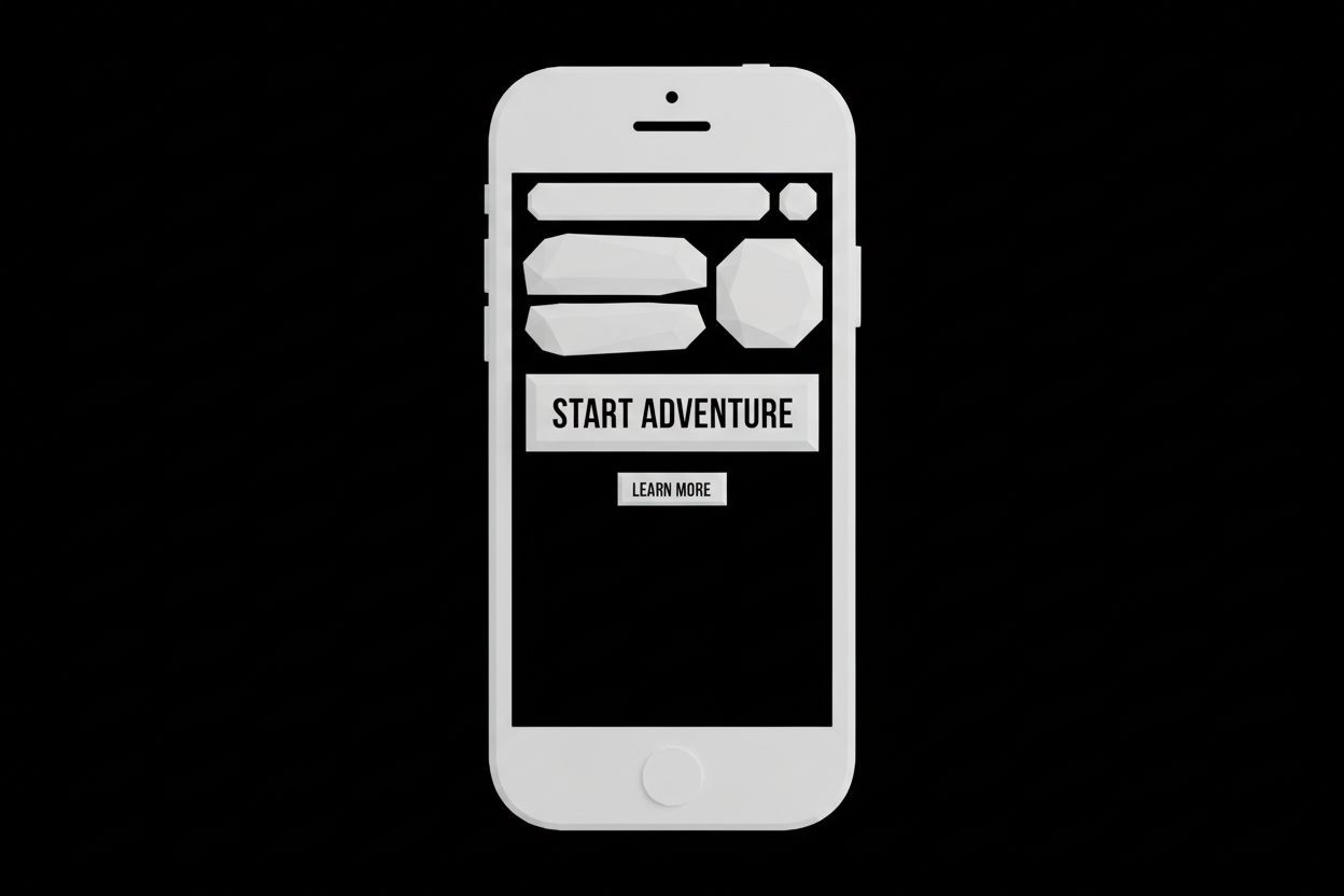
Design controls whether people notice the CTA at all. Mailchimp recommends using visual hierarchy, contrast, placement, and whitespace so the button or link stands out, while Campaign Monitor says a CTA should be easy to see, understand, click, and read with screen readers. If the design hides the CTA, even great copy can underperform. (mailchimp.com)
Make the CTA visible
Use contrast so the CTA does not blend into the page. Add whitespace around it so the eye can land on it quickly. Mailchimp also notes that buttons tend to stand out more than text links in email, and Campaign Monitor found in one test that replacing links with a large CTA button increased click-throughs by 22%. (campaignmonitor.com)
Design for mobile first
Many people will tap your CTA on a phone, not a desktop. W3C’s WCAG guidance recommends a target size of at least 44 by 44 CSS pixels for pointer inputs in many cases, and it also notes that touch users benefit from controls that are easy to hit accurately. That is one reason tiny buttons underperform on mobile. (w3.org)
Use readable text and accessible labels
A CTA button should have a clear accessible name so screen readers can announce it properly. W3C’s ACT rule for buttons requires a non-empty accessible name, and WCAG guidance also emphasizes contrast for readability. For normal text, the contrast ratio guidance is 4.5:1, with larger text allowed at lower ratios. (w3.org)
Place the primary CTA where attention is highest
Above the fold placement still matters, especially on homepage hero sections, landing pages, and short emails. Campaign Monitor says the primary CTA should be easy to access, while Mailchimp and HubSpot both show that CTAs work well when they appear where the reader is already primed to act. In other words, put the button where the decision is easiest. (campaignmonitor.com)
Keep the channel in mind
A CTA on a landing page does not need to behave exactly like a CTA in a TikTok ad or a nurture email. On paid social, the CTA should match the promise of the ad and the destination page. On social content, short and direct wording usually wins. If you want that consistency across channels, automated social media can help keep the message aligned from one post to the next. (mailchimp.com)
Common CTA mistakes
The fastest way to weaken a CTA is to make it too generic. Phrases like click here, learn more, or submit can work in some contexts, but they often leave people guessing about what comes next. Mailchimp specifically warns against vague wording, and Mailchimp also recommends avoiding one-word or friction-heavy copy when a more useful phrase would be clearer. (mailchimp.com)
Other common mistakes include:
Too many competing CTAs on one page. A page can have secondary actions, but the primary CTA should still be obvious. Campaign Monitor recommends one main CTA per email when possible, and Optimizely notes that multiple CTAs only make sense when there are multiple desired actions. (campaignmonitor.com)
A mismatch between the CTA and the landing page. If the CTA promises a guide, the destination page should not suddenly sell a demo. Campaign Monitor is very clear that the page has to live up to the promise. (campaignmonitor.com)
Buttons that are hard to see or hard to tap. Low contrast, tiny targets, and cramped spacing hurt performance. W3C’s contrast and target-size guidance exists for exactly this reason. (w3.org)
No testing at all. If you never test copy, color, placement, or offer, you are guessing. Optimizely advises testing high-impact changes, and Mailchimp recommends using click rates, heatmaps, and recordings to learn what people actually do. (support.optimizely.com)
Trying to change everything at once. When multiple things move at the same time, it becomes hard to tell what caused the result. Optimizely specifically warns that changing too many elements together makes attribution difficult. (support.optimizely.com)
How to test and improve CTAs
The best way to improve a CTA is to test one meaningful variable at a time. That might be the button copy, the color, the placement, the surrounding headline, or the offer itself. Optimizely recommends using A/B tests and focusing on micro-conversions when you want faster feedback, and Mailchimp suggests looking at click rates, scroll maps, heatmaps, and recordings to see where attention drops off. (support.optimizely.com)
If your CTA is part of a lead-generation funnel, do not stop measuring at the click. Track the form fill, the chat start, the booked call, and the sale if possible. That is where a simple CTA becomes a real growth lever. If a visitor clicks but still needs help, automated AI chat agents can continue the conversation and move the lead forward without forcing a hard sell. (support.optimizely.com)
A useful testing habit is to treat every CTA as a hypothesis. Does Get the guide outperform Download now? Does a button below the hero outperform one inside it? Does a shorter form increase completed leads? Those questions are easy to test, and the answers usually make the next round of optimization much clearer. (support.optimizely.com)
Frequently asked questions
What is a call to action in simple words?
A call to action is a prompt that tells someone what to do next. It is usually a button, link, or short phrase that turns interest into action. HubSpot and Optimizely both describe CTAs this way in their glossaries. (knowledge.hubspot.com)
Is a CTA the same as a button?
Not exactly. The CTA is the message or instruction, while the button is the design element people click. A CTA can also be a link, a form prompt, or a short text block depending on the channel. (optimizely.com)
How many CTAs should a page have?
Usually one primary CTA is best, especially on an email or focused landing page. Secondary links can exist, but they should support the main action rather than compete with it. Optimizely says multiple CTAs can work when there are multiple desired actions, and Campaign Monitor recommends sticking with one main goal in email when possible. (optimizely.com)
What makes a CTA convert better?
Clear benefit, strong visibility, short wording, and a landing page that matches the promise. W3C accessibility guidance also matters because people need to be able to see and tap the CTA easily. In practice, the best CTAs make the next step obvious and low friction. (optimizely.com)
The strongest CTA is not the cleverest one. It is the one that makes the next step feel obvious, useful, and safe. If you keep the message clear, the design easy to use, and the offer aligned with the page, your CTA stops being a small detail and starts acting like a conversion tool. (campaignmonitor.com)